Footer
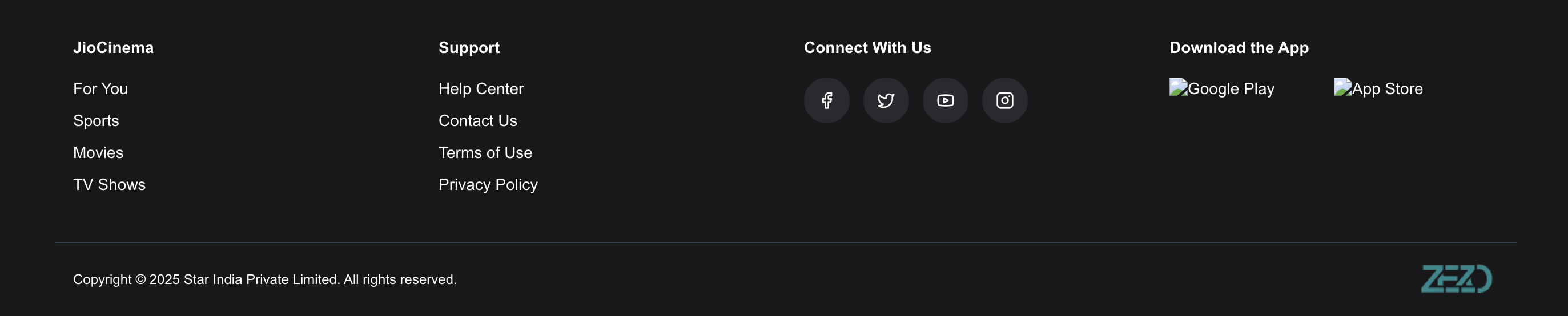
The Footer component is a responsive bottom section used in Zezo OTT apps.
It shows navigation links, support info, social media icons, and your brand logo.
This component is provided by @zezosoft/zezo-ott-react-ui-kit.
✨ Features
- ✅ Two-column layout – Ideal for navigation and support sections
- ✅ Brand logo support – Show your platform logo with
logoUrl - ✅ Social icons – Add Facebook, Twitter, etc. using any icon library
- ✅ Fully responsive – Works perfectly on all screen sizes
🔌 Props
| Prop | Type | Required | Description |
|---|---|---|---|
calumnOne | { title: string; links: { name: string; href: string }[] } | ✅ Yes | Left column – usually for main navigation |
calumnTwo | { title: string; links: { name: string; href: string }[] } | ✅ Yes | Right column – typically for support or legal pages |
socialMedia | { title: string; links: { href: string; icon: ReactNode }[] } | ✅ Yes | Shows icons for your social media profiles |
logoUrl | string | ✅ Yes | Path to your platform’s logo image |
copyright | string | ✅ Yes | Footer bottom text (e.g., copyright statement) |
⚙️ Customizing the Footer
You can customize the entire footer to match your brand by updating:
- Navigation content: Change
calumnOneandcalumnTwowith your own titles and links. - Icons and Social links: Use
lucide-reactorreact-iconsto inject any icons. - Logo: Pass your brand logo via the
logoUrlprop. - Responsive layout: All elements automatically adapt to screen size — no need to handle breakpoints manually.
💡 Example Use Case:
If you want to add a “Download App” section in the footer, just add that undercalumnTwoor create a new prop in a wrapper if needed.
📦 Example
"use client";
import React from "react";
import { Footer as ZezoOttFooter } from "@zezosoft/zezo-ott-react-ui-kit";
import { Facebook, Instagram, Twitter, Youtube } from "lucide-react";

const Footer = () => {
  return (
    <ZezoOttFooter
      calumnOne={{
        title: "Explore",
        links: [
          { name: "For You", href: "#" },
          { name: "Sports", href: "#" },
          { name: "Movies", href: "#" },
          { name: "TV Shows", href: "#" },
        ],
      }}
      calumnTwo={{
        title: "Support",
        links: [
          { name: "Help Center", href: "#" },
          { name: "Contact Us", href: "#" },
          { name: "Terms of Use", href: "#" },
          { name: "Privacy Policy", href: "#" },
        ],
      }}
      socialMedia={{
        title: "Connect With Us",
        links: [
          { href: "#", icon: <Facebook /> },
          { href: "#", icon: <Twitter /> },
          { href: "#", icon: <Youtube /> },
          { href: "#", icon: <Instagram /> },
        ],
      }}
      logoUrl="https://web.zezosoft.com/_next/image?url=https%3A%2F%2Fassets-zezo-stream.s3.ap-south-1.amazonaws.com%2Fsettings%2F248a32c2-a3af-463d-9bf3-f2f39fe323b3.png&w=256&q=75&dpl=dpl_2ZXMS6VXvg96BbjsB2PzE4qdBFS2"
      copyright="© 2025 Zezo OTT. All rights reserved."
    />
  );
};
🧠 Developer Tips
- You can use any icon component for
socialMedia.links.icon, not justlucide-react. - Ensure all
hrefvalues are valid URLs or Next.js routes. - For best results, use transparent PNGs or SVGs for the
logoUrlimage. - Want a sticky or dark-themed footer? Just wrap it in a custom styled layout component.
📦 Install lucide-react
Terminal
npm i lucide-react🖼️ UI Preview
Here’s how the Footer component looks in action:
Last updated on