🔍 Search
The Search component from @zezosoft/zezo-ott-react-native-ui-kit offers a responsive, theme-aware UI for searching movies, series, genres, and more. It provides a seamless user experience with live results, recommendation support, and customizable interaction handlers.
⚙️ Key Features
- 🔎 Live keyword-based search
- 🧠 Recent search history & smart recommendations
- ⌛ Skeleton loading placeholders
- 📭 Graceful handling of no-results or API errors
- 🌙 Auto adapts to light/dark theme
- 🛠️ Fully customizable via event handlers and layout props
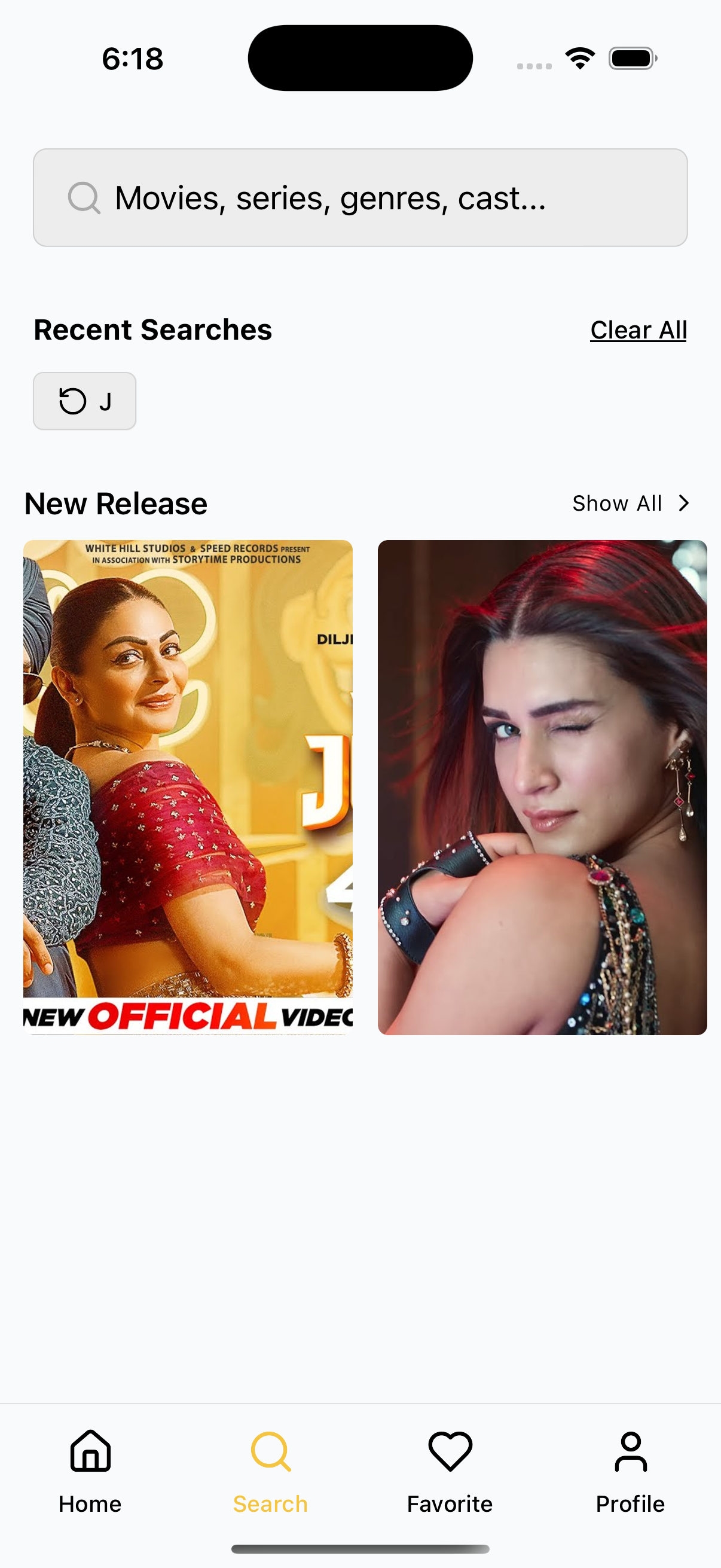
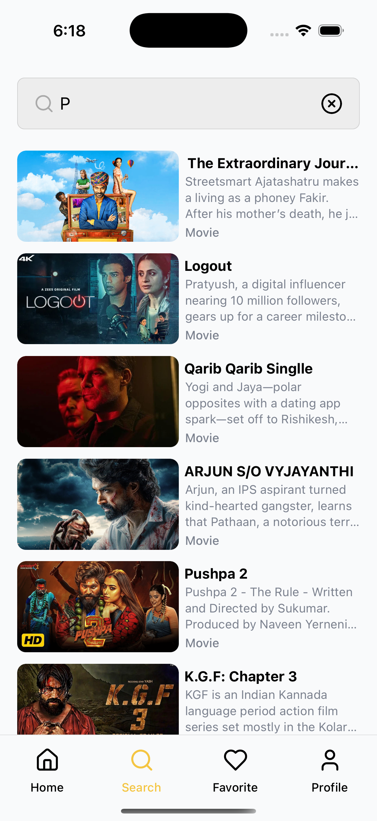
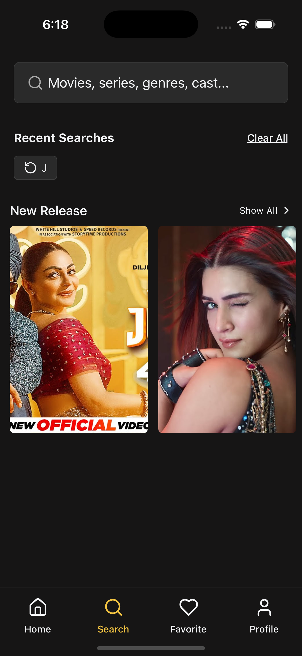
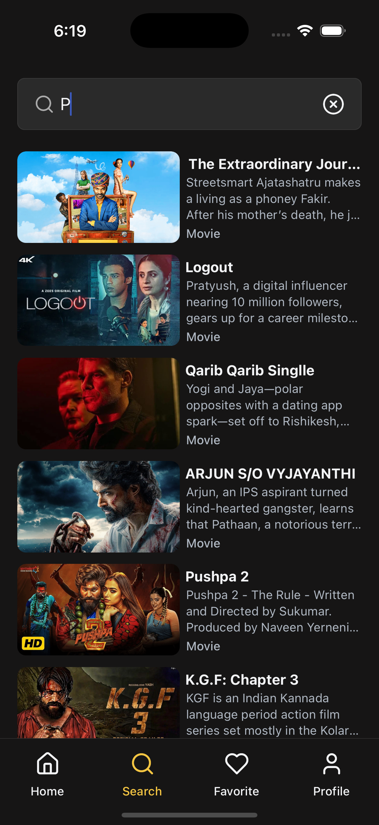
📸 UI Previews
📡 API Call Methods
⚙️ First, set up the
getZezoOttAPI client: API Client Setup
🧪 The following API methods are used in the Search screen:
-
🔗
getZezoOtt().contents.fetchSearchResults(keyword)— Fetches live search results based on the entered keyword. -
🔗
getZezoOtt().sections.get({ category: 'search' })— Retrieves section(s) configured to show recommended content on the Search screen. -
🔁
getZezoOtt().sections.get({ id: sectionId, content_list: true })— Fetches additional pages of recommended content (used inmoreFetchDataRecommended).
🧑💻 Basic Usage
import React, { useState } from "react";
import {
  SafeAreaWrapper,
  Search as ZezoSearch,
} from "@zezosoft/zezo-ott-react-native-ui-kit";

const { One: Search } = ZezoSearch;

const SearchScreen = () => {
  const [keyword, setKeyword] = useState("");

  return (
    <SafeAreaWrapper>
      <Search
        placeholder="Movies, series, genres, cast..."
        search={keyword}
        results={[]} // Replace with actual API result
        isLoading={false}
        noResultsText="No content found"
        recommendedContent={undefined}
        pillMaxCount={5}
        skeletonCardCount={6}
        recommendedContentCardStyles={{}}
        skeletonConfig={{}}
        events={{
          onSubmit: ({ keyword }) => setKeyword(keyword),
          onChangeText: setKeyword,
          onClear: () => setKeyword(""),
          onItemPress: ({ item }) => {
            // Navigate to detail screen
          },
          onPressRecommendedItem: ({ item }) => {
            // Handle recommendation click
          },
          onPressRecommendedMore: ({ section_id }) => {
            // Navigate to full section screen
          },
          moreFetchDataRecommended: async () => {
            // Fetch more recommendations
          },
        }}
      />
    </SafeAreaWrapper>
  );
};

export default SearchScreen;
🔧 Props Reference
| Prop Name | Type | Description |
|---|---|---|
placeholder | string | Input field placeholder text |
search | string | Current search keyword |
results | ISearchItem[] | Array of content to display as search results |
isLoading | boolean | Shows loading skeletons when true |
noResultsText | string | Message shown when no results or API error |
recommendedContent | ISectionItem | null | Optional recommended content section |
pillMaxCount | number | Max number of recent search pills to display |
skeletonCardCount | number | Number of skeleton placeholders to show |
recommendedContentCardStyles | RecommendedCardStyles | Custom styles for recommended content cards |
skeletonConfig | SearchCardSkeletonConfig | Configuration for skeleton loader cards |
theme | AppTheme | Theme override (optional) |
events | object | Callback handlers for input, clear, press, recommendation, fetch |
🎯 Event Handlers
| Event Name | Type | Description |
|---|---|---|
onSubmit | (values: { keyword: string }) => void | Called when search is submitted |
onClear | () => void | Clears the search input |
onChangeText | (text: string) => void | Triggered on each keystroke |
onItemPress | ({ item: IContentData }) => void | Called when a result item is clicked |
onPressRecommendedItem | ({ item: IContentData }) => void | Called when a recommended item is clicked |
onPressRecommendedMore | ({ section_id, name, type }) => void | Called when “More” is tapped for a recommended section |
moreFetchDataRecommended | MoreFetchData<IContentData> | Fetch function for recommended content pagination |
💡 Best Practices
- Use external data hooks (
react-query, SWR) to populateresults. - Combine
skeletonCardCount+isLoadingfor smoother UX. - Customize cards via
recommendedContentCardStylesor slot overrides. - Utilize
pillMaxCountto avoid overflow in recent search chips.
✍️ Created by Naresh Dhamu – Powered by ZezoSoft