📱 Login Phone
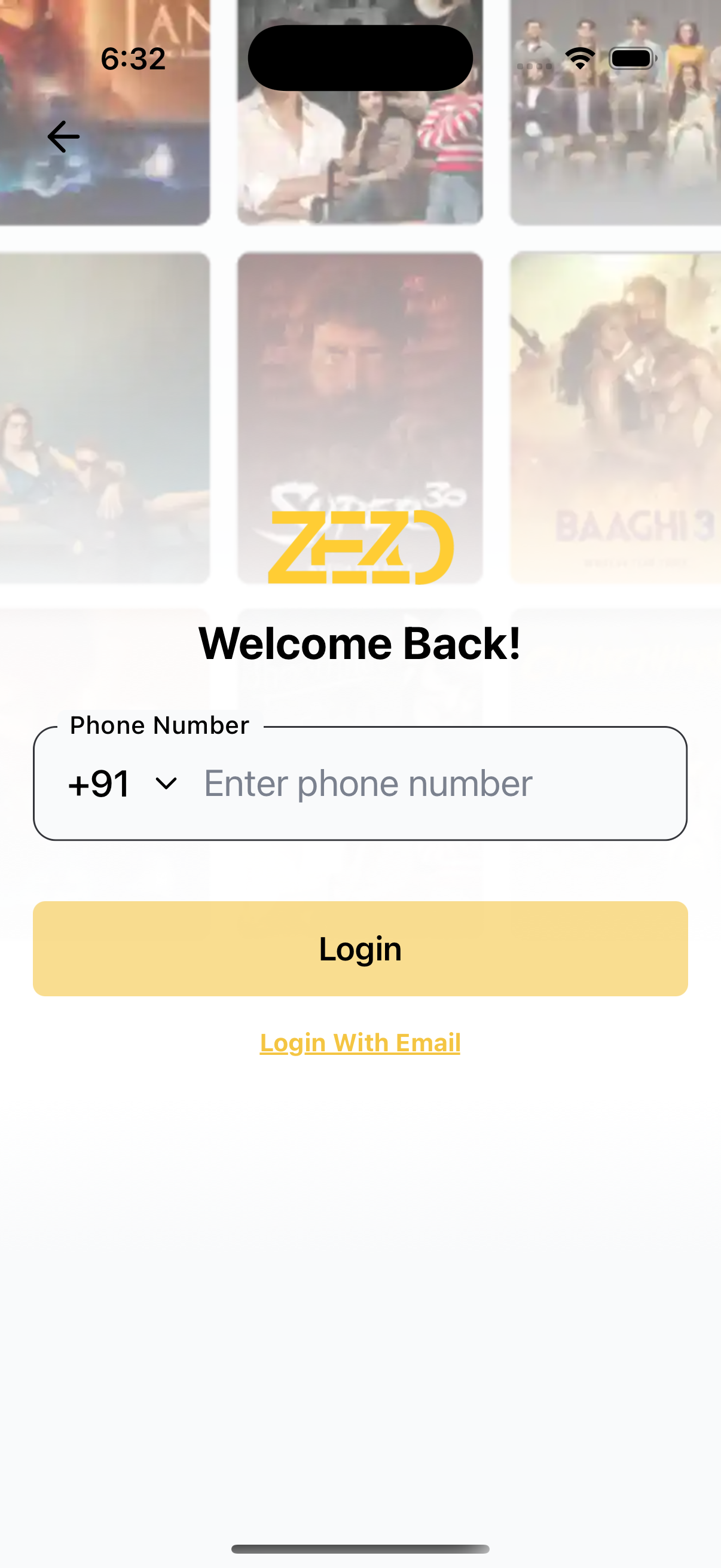
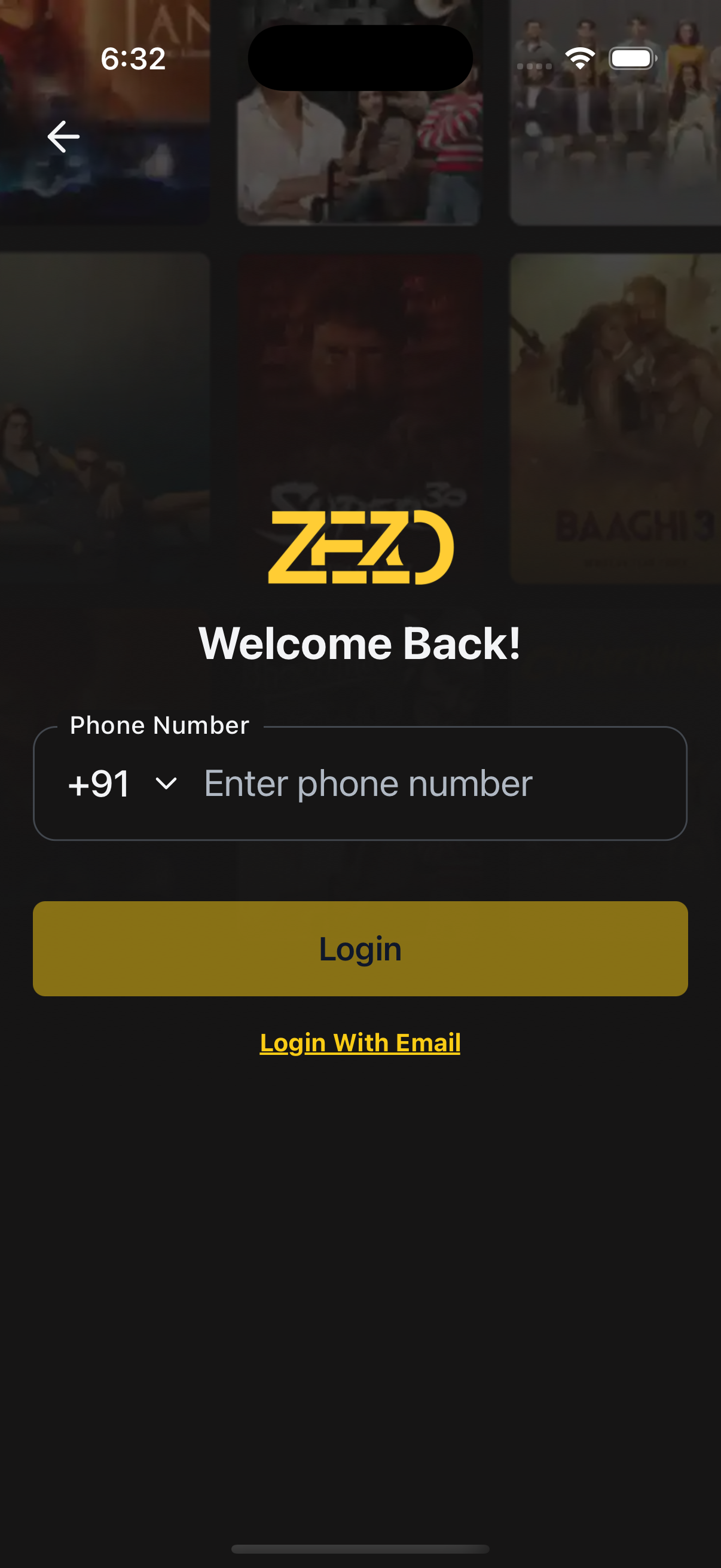
The LoginWithPhone component enables users to log in using their mobile number through a clean and responsive interface.
It includes input validation, theme support, and easy UI customization using render props.
✨ Features
- 📱 Mobile number input with validation (using
react-hook-form) - 🌗 Light/Dark mode support
- 🧩 Customizable UI (logo, buttons, title, etc.)
- 🖼️ Background image with optional gradient
- ⏳ Loading indicator on submit
- 🔁 “Login with Email” support
📸 Preview
🧠 Authentication Note
⚙️ First, setup the getZezoOtt API client: API Client Setup
🔗 CallgetZezoOtt().auth.sendOTP()to send an OTP to the user’s phone number.
📘 See method reference
👉 See Splash Screen Store Setup
🚀 Usage Example
LoginWithPhone.tsx
import React from "react";
import { Auth } from "@zezosoft/zezo-ott-react-native-ui-kit";
import { goBack, navigate } from "@ZezoOtt/utils/NavigationUtil";
import { Route } from "@navigation/routes";
import { useSplashStore } from "@ZezoOtt/store/splashStore";

const PhoneLoginScreen = () => {
  const { splash } = useSplashStore.getState();

  return (
    <Auth.LoginWithPhone
      logoUri={splash.logo}
      title="Welcome Back!"
      onSubmit={(data) => {
        console.log("Phone login:", data); //call your api endpoint method send Otp
      }}
      onTopBackBtnPress={() => goBack()}
      backgroundImage={{
        source: splash.login_poster,
        gradientSplitBackground: 0.4,
      }}
      onLoginWithEmail={() => navigate(Route.LoginWithEmail)}
    />
  );
};

export default PhoneLoginScreen;
🔗 See related route definition:
Routeenum from@navigation/routes.ts
🔧 Props
📌 Core Configuration
| Prop | Type | Description |
|---|---|---|
title | string | Title shown above the input |
logoUri | string | Optional logo image URL |
loadingSubmitBtn | boolean | Show loading spinner on login button |
theme | AppTheme | Optional theme override |
🔀 Handlers & Navigation
| Prop | Type | Description |
|---|---|---|
onSubmit | (values: FormValues) => void | Called when the login form is submitted |
onTopBackBtnPress | () => void | Triggered when top back button is pressed |
onLoginWithEmail | () => void | Triggered when “Login With Email” is pressed |
🧩 Custom Renderers
| Prop | Type | Description |
|---|---|---|
renderLogo | () => ReactNode | Custom logo renderer |
renderPhoneHeader | () => ReactNode | Custom header above phone input |
renderSubmitButton | ({ onPress, disabled, loading }) => ReactNode | Custom login button renderer |
renderLoginWithEmail | () => ReactNode | Custom email login button |
renderTopBackBtn | ({ onPress }) => ReactNode | Custom back button renderer |
🎨 Styling Props
| Prop | Type | Description |
|---|---|---|
containerStyle | ViewStyle | Style override for main container |
titleStyle | TextStyle | Style override for title |
formStyle | ViewStyle | Style override for form container |
inputStyle | TextStyle | Style override for input field text |
inputContainerStyle | ViewStyle | Style override for input wrapper |
topBackBtnStyle | ViewStyle | Style override for top back button |
📝 Customizable Text
| Prop | Type | Description |
|---|---|---|
text | object | Override default field labels and messages |
└── phoneLabel | string | Label for the phone input |
└── phonePlaceholder | string | Placeholder for phone number input |
└── loadingSubmitBtnText | string | Text for loading state of submit button |
└── loginButton | string | Text for login/submit button |
└── loginWithEmailButton | string | Text for “Login With Email” button |
🖼️ Background Image
| Prop | Type | Description |
|---|---|---|
backgroundImage | object | Background image settings |
└── source | string | null | Image URL or path |
└── resizeMode | 'cover' | 'contain' | 'stretch' | 'repeat' | How the background image should resize |
└── onImageError | (error: Error) => void | Error handler when image fails to load |
└── gradientSplitBackground | number | Position of gradient split (e.g. 0.4) |
🧪 Validation
- Phone number is required and must be at least 10 digits
- Error message:
"Please enter a valid phone number"
📝 Default Texts
{
  phoneLabel: 'Phone Number',
  phonePlaceholder: 'Enter phone number',
  loginButton: 'Login',
  loadingSubmitBtnText: 'Logging in...',
  loginWithEmailButton: 'Login With Email',
}
🎨 UI Overrides
Custom Submit Button
LoginWithPhone.tsx
import { Auth } from "@zezosoft/zezo-ott-react-native-ui-kit";

<Auth.LoginWithPhone
  renderSubmitButton={({ onPress, disabled, loading }) => (
    <MyCustomButton
      title="Continue"
      onPress={onPress}
      disabled={disabled}
      loading={loading}
    />
  )}
/>;
Custom Logo & Header
LoginWithPhone.tsx
import { Auth } from "@zezosoft/zezo-ott-react-native-ui-kit";

<Auth.LoginWithPhone
  renderLogo={() => <MyLogo />}
  renderPhoneHeader={() => (
    <Text style={{ fontSize: 24 }}>Sign in with Mobile</Text>
  )}
/>;
✅ Summary
- Runs fully on-device (no server calls)
- Validates phone number input
- Supports branding and UI overrides
- Ideal for OTP or passwordless flows
✍️ Created by Naresh Dhamu – Powered by ZezoSoft
Last updated on