📩 Login Email
A production-ready, flexible email/password login screen for React Native apps.
Built with react-hook-form, themed by the Zezo OTT UI Kit, and fully customizable via render props.
✨ Features
- Email & password login with real-time validation
- Built-in error handling with
react-hook-form - Light/dark mode support via theming system
- Optional background image and logo
- Optional top-back button and bottom signup switch
- Customizable UI with override renderers
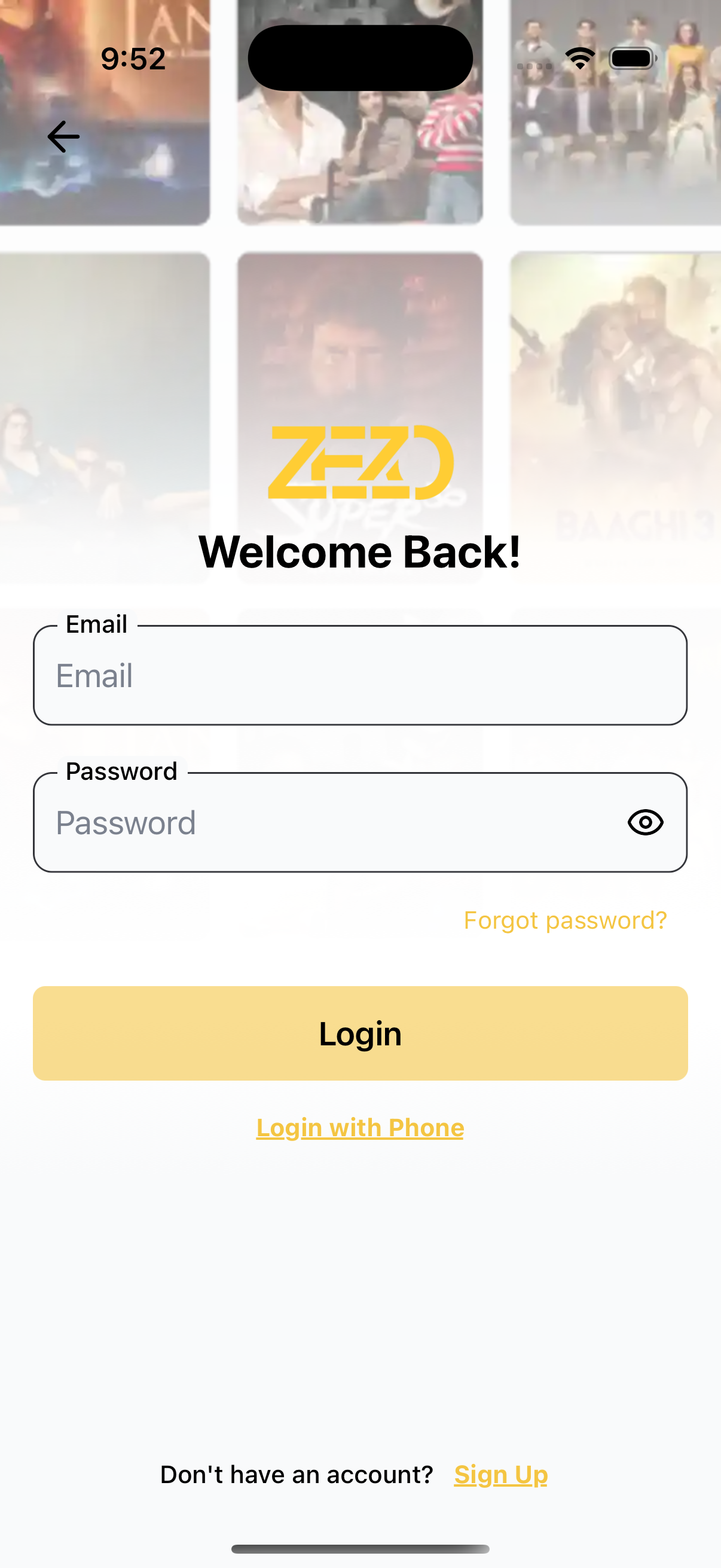
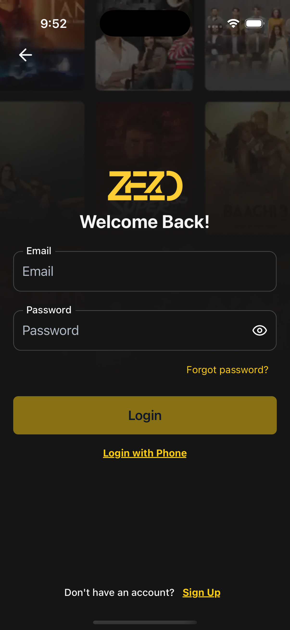
📸 Preview
🧠 Authentication Note
⚙️ First, setup the getZezoOtt API client: API Client Setup
🔗 CallgetZezoOtt().auth.login()to authenticate the user.
📘 See method reference
👉 See Splash Screen Store Setup
🚀 Usage Example
EmailLoginScreen.tsx
import React from "react";
import { Auth } from "@zezosoft/zezo-ott-react-native-ui-kit";
import { goBack, navigate } from "@ZezoOtt/utils/NavigationUtil";
import { Route } from "@navigation/routes";
import { useSplashStore } from "@ZezoOtt/store/splashStore";

const EmailLoginScreen = () => {
  const { splash } = useSplashStore.getState();

  return (
    <Auth.LoginWithEmail
      logoUri={splash.logo}
      title="Welcome Back!"
      onSubmit={(data) => {
      console.log(data). //call your api endpoint method
      }}
      onForgotPassword={() => navigate(Route.ForgetPassword)}
      onTopBackBtnPress={() => goBack()}
      backgroundImage={{
        source: splash.login_poster,
        gradientSplitBackground: 0.4,
      }}
      onSignup={() => navigate(Route.Register)}
      onSwitchToPhoneLogin={() => navigate(Route.LoginWithPhone)}
    />
  );
};

export default EmailLoginScreen;
🔗 See related route definition:
Routeenum from@navigation/routes.ts
🔧 Props
📌 Core Configuration
| Prop | Type | Description |
|---|---|---|
title | string | Title shown above the form |
logoUri | string | Optional logo image URL |
minPasswordLength | number | Minimum characters required for password |
loadingSubmitBtn | boolean | Show loading spinner on login button |
theme | AppTheme | Optional theme override for light/dark mode |
🔀 Handlers & Navigation
| Prop | Type | Description |
|---|---|---|
onSubmit | (form) => void | Called when login form is submitted |
onSignup | () => void | Navigate to signup screen |
onForgotPassword | () => void | Navigate to forgot password screen |
onSwitchToPhoneLogin | () => void | Switch to phone login screen |
onTopBackBtnPress | () => void | Triggered when top back button is pressed |
🎨 Styling Props
| Prop | Type | Description |
|---|---|---|
containerStyle | ViewStyle | Style override for main container |
titleStyle | TextStyle | Style override for title |
formStyle | ViewStyle | Style override for form container |
inputStyle | TextStyle | Style override for input fields |
inputContainerStyle | ViewStyle | Style override for input containers |
topBackBtnStyle | ViewStyle | Style override for top back button |
signupTextProps | TextStyle | Style for “Don’t have an account?” text |
signupLinkTextProps | TextStyle | Style for “Sign Up” link text |
📝 Customizable Text
| Prop | Type | Description |
|---|---|---|
text | object | Override default field labels and messages |
└── emailLabel | string | Label for the email field |
└── emailPlaceholder | string | Placeholder for the email field |
└── passwordLabel | string | Label for the password field |
└── passwordPlaceholder | string | Placeholder for the password field |
└── forgotPassword | string | Text for the “Forgot Password?” link |
└── loadingSubmitBtnText | string | Text while login button is loading |
└── loginButton | string | Text for login button |
└── signupPrompt | string | Prompt before the sign-up link |
└── signupLink | string | Text for the sign-up link |
└── switchToPhoneLogin | string | Text for the switch to phone login button |
🖼️ Background Image
| Prop | Type | Description |
|---|---|---|
backgroundImage | object | Background image settings |
└── source | string | null | Image URL or path |
└── resizeMode | 'cover' | 'contain' | 'stretch' | 'repeat' | How the background image should resize |
└── onImageError | (error: Error) => void | Error handler when image fails to load |
└── gradientSplitBackground | number | Position of gradient split (e.g. 0.4) |
🧩 Custom Renderers
| Prop | Type | Description |
|---|---|---|
renderLogo | () => ReactNode | Custom component for logo |
renderEmailHeader | () => ReactNode | Custom header above the email field |
renderSubmitButton | (props) => ReactNode | Custom renderer for submit button |
renderForgotPassword | () => ReactNode | Custom renderer for forgot password link |
renderSignupPrompt | (props: { onPress: () => void }) => ReactNode | Custom sign-up prompt renderer |
renderTopBackBtn | (props: { onPress: () => void }) => ReactNode | Custom top back button renderer |
renderSwitchToPhoneLogin | (props: { onPress: () => void }) => ReactNode | Custom phone login switch renderer |
🧪 Validation
- Email is required and must follow a valid format
- Password is required, minimum 6 characters
📝 Default Texts
If text prop is not provided, the following defaults are used:
{
  emailLabel: 'Email',
  emailPlaceholder: 'Enter your email',
  passwordLabel: 'Password',
  passwordPlaceholder: 'Enter your password',
  forgotPassword: 'Forgot Password?',
  loadingSubmitBtnText: 'Logging in...',
  loginButton: 'Login',
  signupPrompt: "Don't have an account?",
  signupLink: 'Sign Up',
  switchToPhoneLogin: 'Login With Phone'
}
🎨 Theming
- Auto light/dark mode detection
- Override styles via
themeprop - Optional gradient and image support
✍️ Created by Naresh Dhamu – Powered by ZezoSoft
Last updated on