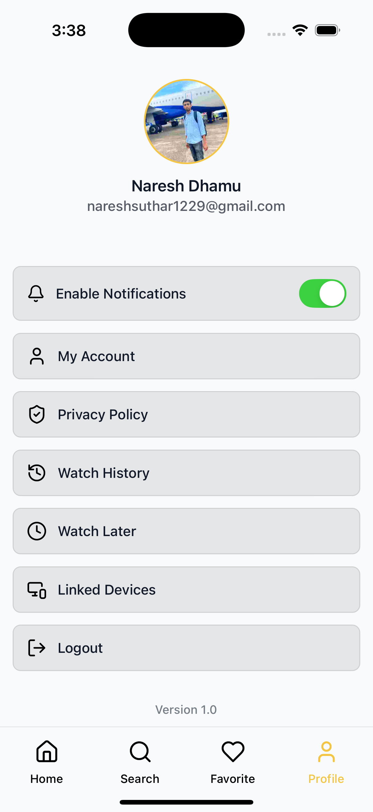
⚙️ App Settings Screen
An example implementation of the AppSettings component, designed to display user profile information and customizable menu settings in a modular, theme-aware layout for OTT apps.
📸 Preview
📡 API Call Methods
⚙️ First, set up the
getZezoOttAPI client: API Client Setup
🧪 The following API methods are typically used in the settings screen:
- 🔗
getZezoOtt().auth.whoami()— Get current user profile details (name, email, avatar) - 🔗
getZezoOtt().auth.logout()— Logout and invalidate the current session - 🔗
getZezoOtt().appSettings.getPagesList()— Retrieve list of static app pages (Privacy Policy, Terms, etc.)
🚀 Usage Example
AppSettingsScreen.tsx
import React from "react";
import {
AppSettings,
SafeAreaWrapper,
} from "@zezosoft/zezo-ott-react-native-ui-kit";
import { Text, Alert } from "react-native";
const AppSettingsScreen = () => {
// 🧑💼 Replace `userInfo` fields with live data from `getZezoOtt().auth.whoami()`
const userInfo = {
name: "Naresh Dhamu",
avatarUri:
"https://avatars.githubusercontent.com/u/89912059?s=400&u=887606d77116716a20e891cdca74c4e58ec7d60f&v=4",
emailOrPhone: "nareshsuthar1229@gmail.com",
onEditPress: () => console.log("Edit Profile Pressed"),
};
const menuItems = [
{
key: "my_account",
label: "My Account",
type: "pressable",
onPress: () => console.log("Navigate to My Account"),
},
{
key: "logout",
label: "Logout",
type: "pressable",
onPress: () => Alert.alert("Logout Pressed"),
},
];
return (
<SafeAreaWrapper>
<AppSettings
title="Settings"
userInfo={userInfo}
menuItems={menuItems}
isLoading={false}
renderFooter={() => <Text>Version 1.0</Text>}
/>
</SafeAreaWrapper>
);
};
export default AppSettingsScreen;⚙️ Props Summary (AppSettings Props)
| Prop | Type | Description |
|---|---|---|
title | string | Screen title |
userInfo | UserInfo | User profile object |
menuItems | MenuItem[] | Array of pressable/toggle menu items |
theme | AppTheme | Optional theme override |
isLoading | boolean | Controls skeleton loading state |
onMenuItemPress | (item: MenuItem) => void | Callback when menu item is selected |
renderHeader | () => React.ReactNode | Optional custom header renderer |
renderFooter | () => React.ReactNode | Optional custom footer renderer |
👤 User Info Object
{
  name: "Naresh Dhamu",
  avatarUri:"https://avatars.githubusercontent.com/u/89912059?s=400&u=887606d77116716a20e891cdca74c4e58ec7d60f&v=4",
  emailOrPhone: "nareshsuthar1229@gmail.com",
  onEditPress: () => console.log("Edit Profile Pressed"),
}- Sourced from a dummy API or static data.
- Supports avatar and edit callback.
- Skeleton loader shows during data fetch if
isLoadingis true.
📋 Menu Items
| Key | Label | Type | Action |
|---|---|---|---|
my_account | My Account | Pressable | Navigate to profile screen |
logout | Logout | Pressable | Shows alert on press |
🔁 Logout Flow
- Tap logout item.
- Shows alert dialog.
- (In production: connect to logout API)
🎨 Theme & Customization
| Prop | Description |
|---|---|
menuItemStyle | Style for menu item container, icon, and text |
userInfoTextStyle | Overrides for name/email text in user section |
avatarComponent | Optional custom avatar renderer |
onBackPress | Callback for top back button (if implemented) |
renderHeader | Inject custom header JSX |
renderFooter | Inject footer JSX (e.g., version info) |
✅ Summary
- 🧩 Modular screen using reusable
AppSettingscomponent - 📄 Displays static or API-based user info
- ⚡ Handles logout and user actions
- 🎨 Customizable props and style hooks
✍️ Created by Naresh Dhamu – Powered by ZezoSoft
Last updated on