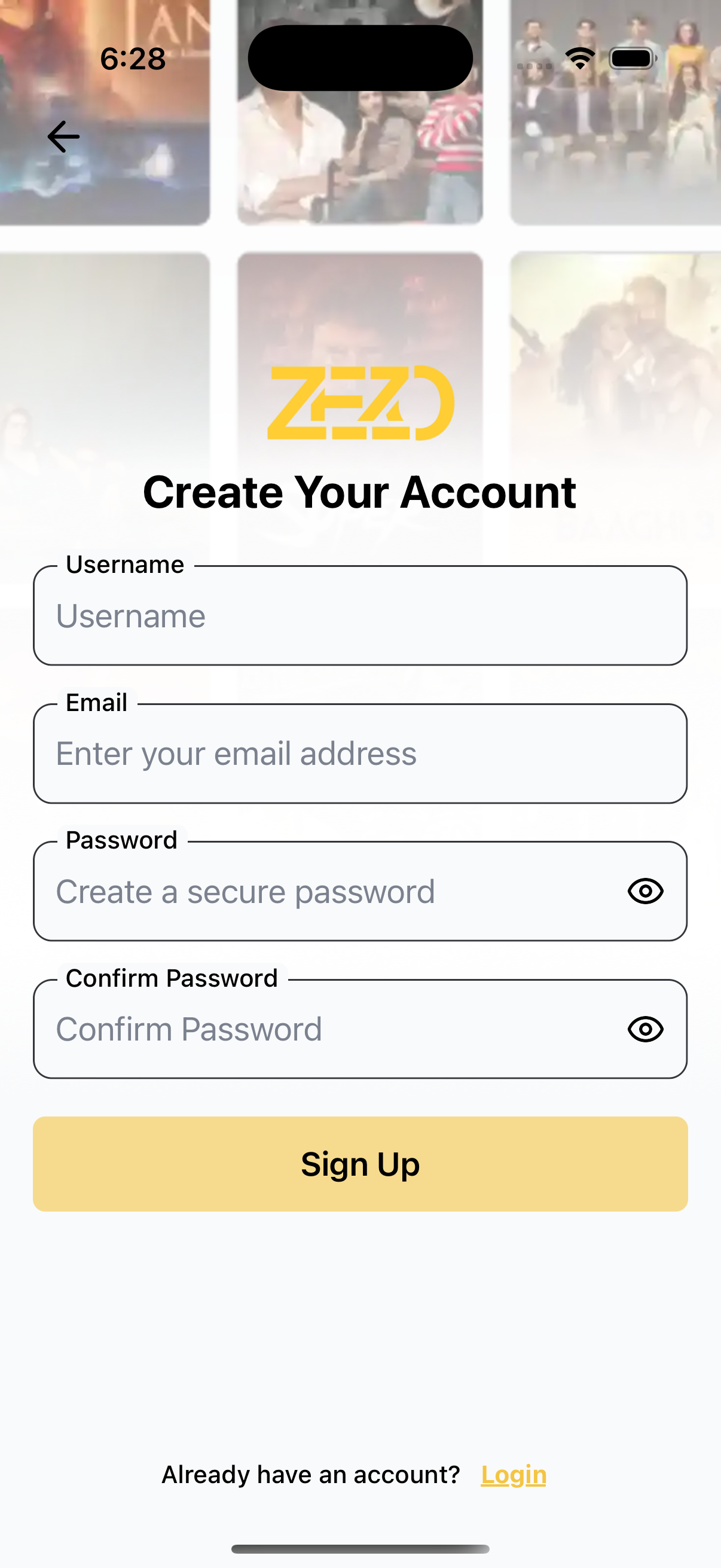
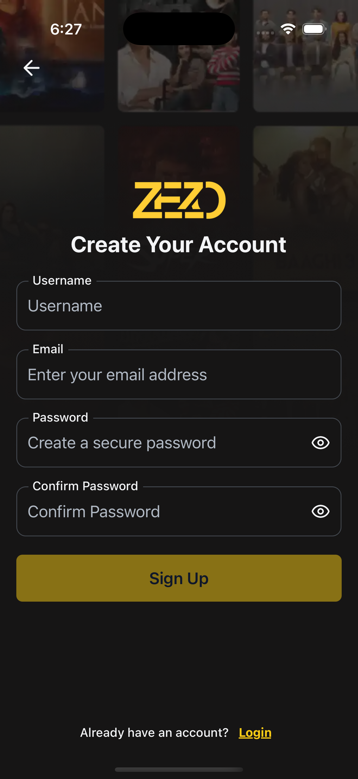
📝 SignUp
A fully customizable and reusable signup screen built for React Native apps. Includes form validation, dark/light theme support, and full layout control via render props.
✨ Features
- 👤 Username, email, password, confirm password fields
- ✅ Real-time validation using
react-hook-form - 🌗 Light/dark mode with theming support
- 🖼️ Background image & gradient overlay support
- 🎨 Customizable UI (logo, headers, back button, etc.)
- 🔁 Login redirect and flexible button rendering
📸 Preview
🧠 Authentication Note
⚙️ First, setup the getZezoOtt API client: API Client Setup
🔗 CallgetZezoOtt().auth.signUp()to register a new user.
📘 See method reference
👉 See Splash Screen Store Setup
🚀 Usage
SignUp.tsx
import React from "react";
import { Auth } from "@zezosoft/zezo-ott-react-native-ui-kit";
import { goBack, navigate } from "@ZezoOtt/utils/NavigationUtil";
import { Route } from "@navigation/routes";
import { useSplashStore } from "@ZezoOtt/store/splashStore";

const SignUpScreen = () => {
  const { splash } = useSplashStore.getState();

  return (
    <Auth.SignUp
      logoUri={splash.logo}
  title="Create Your Account"
      onSubmit={(data) => {
      console.log(data). //call your api endpoint method
      }}
      onTopBackBtnPress={() => goBack()}
      backgroundImage={{
        source: splash.login_poster,
        gradientSplitBackground: 0.4,
      }}
      onLogin={() => navigate(Route.Register)}

    />
  );
};

export default SignUpScreen;
🔗 See related route definition:
Routeenum from@navigation/routes.ts
🔧 Props
📌 Core Configuration
| Prop | Type | Description |
|---|---|---|
title | string | Title displayed above the signup form |
onSubmit | (values: FormValues) => void | Called when the signup form is submitted |
onLogin | () => void | Called when user taps the “Login” link |
onTopBackBtnPress | () => void | Handler for top back button |
logoUri | string | Optional logo image URL |
loadingSubmitBtn | boolean | Show loading spinner on signup button |
theme | AppTheme | Optional theme override |
minPasswordLength | number | Minimum password length (default: 6) |
🎨 Styling Props
| Prop | Type | Description |
|---|---|---|
containerStyle | ViewStyle | Style override for main container |
titleStyle | TextStyle | Style override for title text |
formStyle | ViewStyle | Style override for form wrapper |
inputStyle | TextStyle | Style override for input fields |
inputContainerStyle | ViewStyle | Style override for input field wrapper |
topBackBtnStyle | ViewStyle | Style override for top back button |
loginTextProps | TextStyle | Style for the “Already have an account?” text |
loginLinkTextProps | TextStyle | Style for the “Login” link |
🧹 Custom Renderers
| Prop | Type | Description |
|---|---|---|
renderLogo | () => ReactNode | Custom renderer for the logo |
renderSingUpHeader | () => ReactNode | Custom renderer above the signup form |
renderLoginPrompt | () => ReactNode | Custom login prompt (instead of default text + link) |
renderSubmitButton | ({ onPress, disabled, loading }) => ReactNode | Custom submit button renderer |
renderTopBackBtn | ({ onPress }) => ReactNode | Custom back button renderer |
🖼️ Background Image
| Prop | Type | Description |
|---|---|---|
backgroundImage | object | Background image settings |
└── source | string | null | Image URL or path |
└── resizeMode | 'cover' | 'contain' | 'stretch' | 'repeat' | How the background image should resize |
└── onImageError | (error: Error) => void | Error handler when image fails to load |
└── gradientSplitBackground | number | Position of gradient split (e.g. 0.4) |
📝 Customizable Text
| Prop | Type | Description |
|---|---|---|
text | object | Customize field labels, placeholders, etc. |
└─ usernameLabel | string | Label for username field |
└─ usernamePlaceholder | string | Placeholder for username input |
└─ emailLabel | string | Label for email field |
└─ emailPlaceholder | string | Placeholder for email input |
└─ passwordLabel | string | Label for password field |
└─ passwordPlaceholder | string | Placeholder for password input |
└─ confirmPasswordLabel | string | Label for confirm password field |
└─ confirmPasswordPlaceholder | string | Placeholder for confirm password input |
└─ loginPrompt | string | Text prompting to log in |
└─ loginLink | string | Text for login action link |
└─ signupButton | string | Text for the submit/signup button |
└─ loadingSubmitBtnText | string | Text shown during signup loading state |
🧪 Validation
- 🧾 Username: required, min 3 characters
- 📧 Email: required, must match format
/^\S+@\S+\.\S+$/ - 🔒 Password: required, min
minPasswordLength - ✅ Confirm Password: must match
password
📝 Default Texts
If text prop is not passed, the following values are used:
{
  usernameLabel: 'Username',
  usernamePlaceholder: 'Enter your username',
  emailLabel: 'Email',
  emailPlaceholder: 'Enter your email address',
  passwordLabel: 'Password',
  passwordPlaceholder: 'Create a password',
  confirmPasswordLabel: 'Confirm Password',
  confirmPasswordPlaceholder: 'Re-enter your password',
  loginPrompt: 'Already have an account?',
  loginLink: 'Login',
  signupButton: 'Sign Up',
  loadingSubmitBtnText: 'Creating account...'
}
✅ Summary
- 🧩 Built with developer ergonomics in mind
- 🔐 Validates all fields with fallback messaging
- 🎨 Supports full theming and UI overrides
- 🔄 Easily integrates with login flows
✍️ Created by Naresh Dhamu — Powered by ZezoSoft
Last updated on