🔐 OTP Verification
A sleek, customizable OTP verification screen for React Native apps. Supports themes, validation, background images, and full UI overrides. Ideal for login and onboarding flows.
✨ Features
-
🔢 OTP input using
react-native-confirmation-code-field -
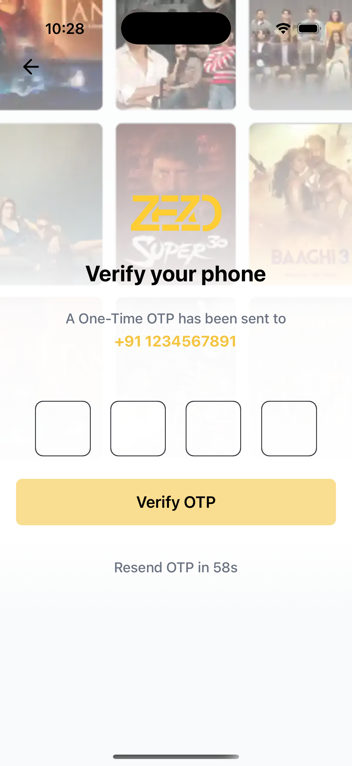
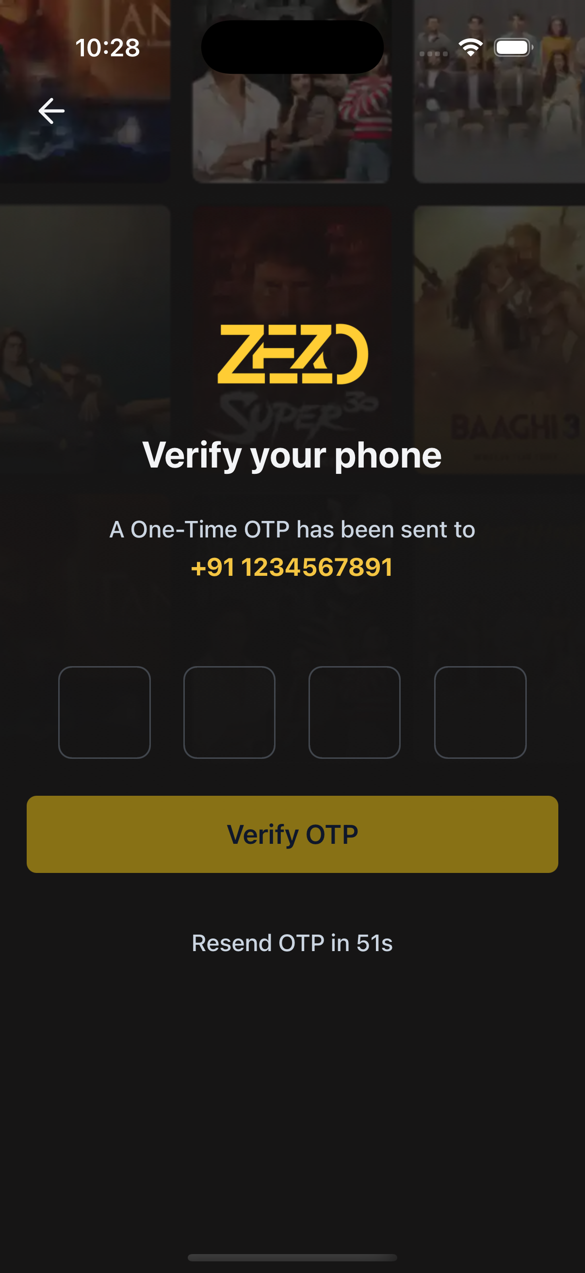
📱 Shows phone number where OTP was sent
-
🎨 Theme support (light/dark/custom)
-
⏳ Resend OTP with countdown timer
-
🖼️ Background image with optional gradient
-
🔧 Render props for custom components:
- Submit Button
- OTP Input
- Resend Button
- Back Button
-
⚙️ Keyboard-aware layout for better UX
-
🔒 OTP length customizable (default: 4 digits)
📸 Preview
📡 API Call
⚙️ First, setup the getZezoOtt API client: API Client Setup
🔗 CallgetZezoOtt().auth.verifyOTP()to verify the OTP entered by the user.
📘 See method reference
👉 See Splash Screen Store Setup
🚀 Usage
import React from "react";
import { Auth } from "@zezosoft/zezo-ott-react-native-ui-kit";
import { goBack } from "@ZezoOtt/utils/NavigationUtil";
import { useSplashStore } from "@ZezoOtt/store/splashStore";

const OtpVerificationScreen = () => {
  const { splash } = useSplashStore.getState();

  return (
    <Auth.OTP
      title="Verify your phone"
      phoneNumber="+919876543210"
      logoUri={splash.logo}
      backgroundImage={{
        source: splash.login_poster,
        gradientSplitBackground: 0.4,
      }}
      resendDisabledTime={60}
      onTopBackBtnPress={() => goBack()}
      onSubmit={({ otp }) => {
        console.log("OTP Submitted:", otp); // Replace with your OTP verification logic
      }}
      onResendOtp={() => {
        console.log("Resend tapped"); // Replace with resend OTP logic
      }}
      text={{
        otpSentText: "OTP has been sent to",
        submitButton: "Verify OTP",
      }}
    />
  );
};

export default OtpVerificationScreen;
🔗 See related route definition:
Routeenum from@navigation/routes.ts
Props
📌 Core Configuration
| Prop | Type | Description |
|---|---|---|
title | string | Title displayed above the form |
onSubmit | (values: { otp: string }) => Promise<void> | void | Called when OTP is submitted |
onTopBackBtnPress | () => void | Handler for top back button |
logoUri | string | Optional logo image URL |
phoneNumber | string | Phone number displayed to the user |
theme | AppTheme | Optional theme override |
loading | boolean | Show loading spinner on submit button |
otpDigitCount | number | Number of digits for OTP input |
keyboardType | KeyboardTypeOptions | Keyboard type for OTP input (e.g., number-pad) |
resendDisabledTime | number | Countdown in seconds before resend is enabled |
onResendOtp | () => void | Called when resend button is tapped |
text | object | Object to override labels, placeholders, etc. |
🎨 Styling Props
| Prop | Type | Description |
|---|---|---|
containerStyle | ViewStyle | Style override for outer container |
titleStyle | TextStyle | Style override for title text |
formStyle | ViewStyle | Style override for the form container |
backBtnStyle | ViewStyle | Style override for back button |
cellStyle | TextStyle | Style override for OTP input cells |
focusCellStyle | TextStyle | Style for focused OTP input cell |
🖼️ Background Image
| Prop | Type | Description |
|---|---|---|
backgroundImage | object | Background image settings |
└── source | string | null | Image URL or local path |
└── resizeMode | 'cover' | 'contain' | 'stretch' | 'repeat' | Image resizing behavior |
└── onImageError | (error: Error) => void | Callback on image load failure |
└── gradientSplitBackground | number | Gradient split position (e.g., 0.4 = 40%) |
🧹 Custom Renderers
| Prop | Type | Description |
|---|---|---|
renderLogo | () => ReactNode | Custom renderer for logo |
renderOtpHeader | () => ReactNode | Custom renderer above OTP form |
renderOtpInput | (props: { value: string; onChange: (value: string) => void; isFocused: boolean[] }) => ReactNode | Custom OTP input fields |
renderSubmitButton | ({ onPress, disabled, loading }) => ReactNode | Custom submit button |
renderBackButton | ({ onPress }) => ReactNode | Custom back button |
renderResendButton | ({ onPress, disabled }) => ReactNode | Custom resend button |
renderPhoneText | (phoneNumber: string) => ReactNode | Custom phone number display renderer |
📝 Customizable Text
| Prop | Type | Description |
|---|---|---|
text | object | Customize field labels, placeholders, etc. |
└─ otpLabel | string | Label above the OTP input field |
└─ otpPlaceholder | string | Placeholder inside each OTP digit field |
└─ submitButton | string | Text shown on the submit/verify button |
└─ loadingSubmitBtnText | string | Text shown when the submit button is in loading state |
└─ otpSentText | string | Text prefix before the displayed phone number |
└─ resendOtpText | string | Text for the resend OTP button when enabled |
└─ resendOtpCountdownText | string | Countdown text while resend is disabled (e.g., “in 30s”) |
📝 Default Texts
These can be overridden using the text prop:
{
  otpLabel: 'Enter OTP',
  otpPlaceholder: '••••',
  submitButton: 'Verify OTP',
  loadingSubmitBtnText: 'Verifying...',
  otpSentText: 'A One-Time OTP has been sent to',
  resendOtpText: 'Resend OTP',
  resendOtpCountdownText: 'Resend OTP in'
}
✅ OTP Validation
- Only numeric input allowed
- Button disabled if OTP length is incomplete
onSubmitis called with OTP on successonResendOtpis disabled during countdown
🔁 Resend Logic
- Button disabled for
resendDisabledTimeseconds - Timer resets on each resend
- Countdown can be customized or overridden
📀 Layout Overview
- 🔙 Back Button (optional)
- 🖼️ Logo (optional)
- 📝 Title
- 📱 Phone Number
- 🔢 OTP Input
- ✅ Submit Button
- 🔁 Resend OTP with countdown
✍️ Created by Naresh Dhamu — Powered by ZezoSoft