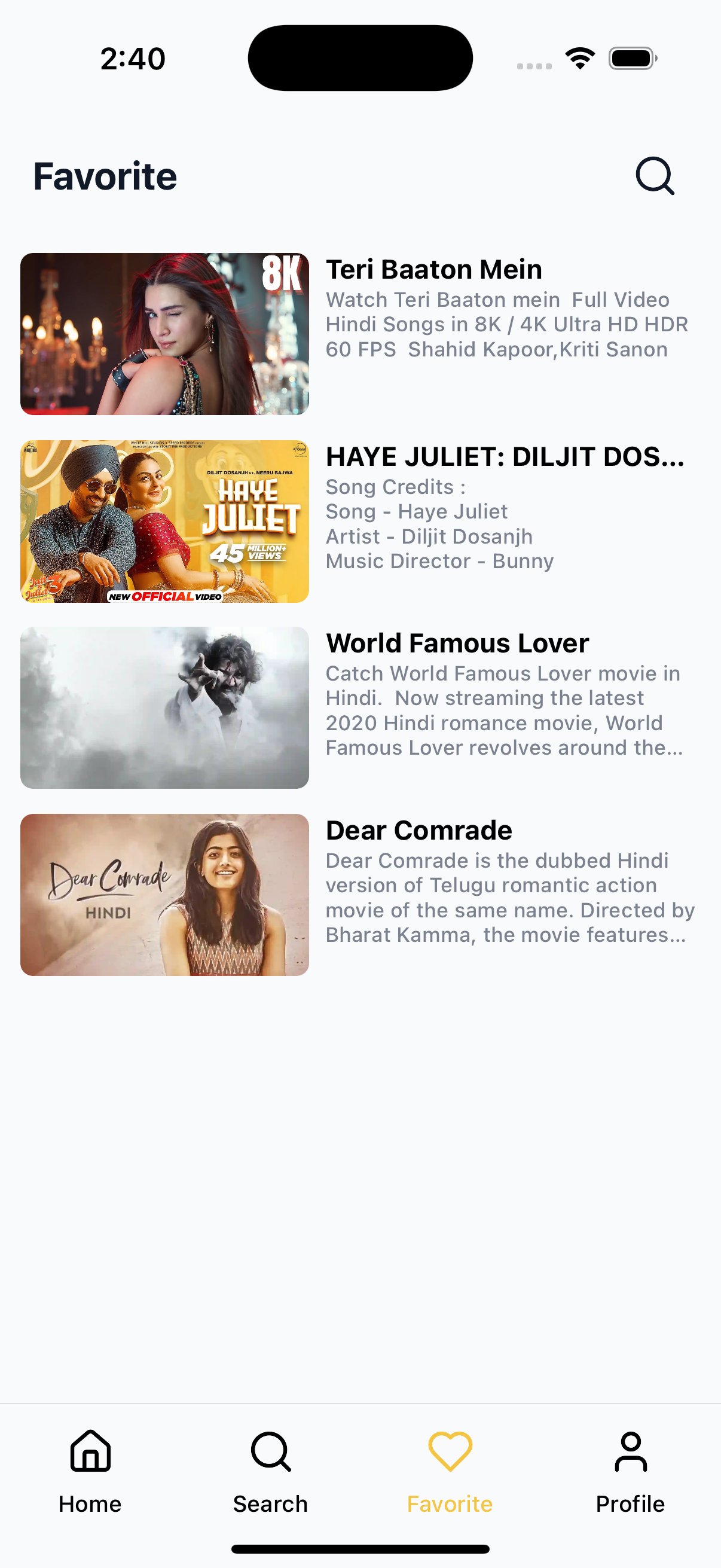
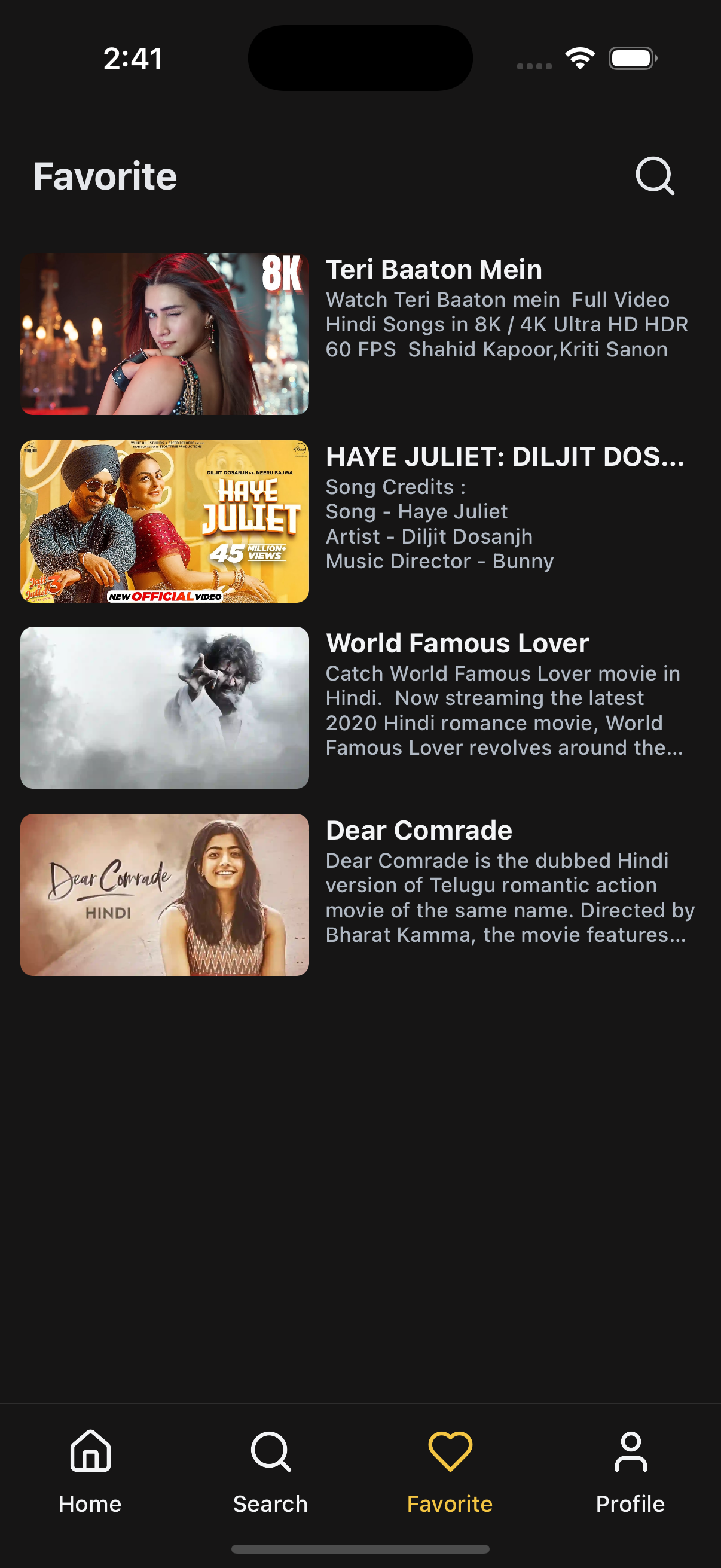
⭐ Favorite Screen
An example implementation of the WatchLater component, customized to render user-marked favorite content in an OTT app. This screen is responsive, theme-aware, and handles loading, empty states, and item interactions seamlessly.
✨ Features
- 📃 Lists favorite content in detailed view
- ⏳ Built-in skeleton loader while fetching
- 🖼️ Thumbnail, title & meta for each item
- 🔍 Search icon in the header
- 🧠 Smooth data fetching using
React Query - 📱 Safe for all screen notches with
SafeAreaWrapper
📸 Preview
📡 API Call Methods
⚙️ First, set up the
getZezoOttAPI client: API Client Setup
🧪 The following API methods are used to fetch user favorite content:
- 🔗
getZezoOtt().favorites.get()— Fetch user favorite/watchlist items - 🔗
getZezoOtt().favorites.removeFromFavorites()— Remove item from favorites
🚀 Usage Example
FavoriteScreen.tsx
import React from "react";
import {
  WatchLater,
  SafeAreaWrapper,
} from "@zezosoft/zezo-ott-react-native-ui-kit";

const FavoriteScreen = () => {
  return (
    <SafeAreaWrapper>
      <WatchLater
        title="Favorite"
        data={[]} // ← Replace with API response from getZezoOtt().favorites.get()
        viewMode="detailed"
        onPressItem={(item) => console.log("Item pressed:", item)}
        onSearchPress={() => console.log("click")}
        showSearchIcon={true}
        skeletonCount={6}
        noDataText="No favorites found"
        onBackPress={() => console.log("Back pressed")}
        onEndReached={() => console.log("Reached end")}
        onEndReachedThreshold={0.5}
        spacing={10}
        itemDimension={130}
        contentContainerStyle={{ paddingBottom: 100, paddingHorizontal: 10 }}
        listStyle={{ marginTop: 10 }}
        titleStyle={{ fontSize: 18, fontWeight: "bold" }}
      />
    </SafeAreaWrapper>
  );
};

export default FavoriteScreen;
⚙️ Props in Use
| Prop | Type | Description |
|---|---|---|
title | string | Title of the screen |
data | array | List of favorite items from API |
isLoading | boolean | Shows loading skeleton if true |
viewMode | string | Layout mode: ‘detailed’ or ‘grid’ |
onPressItem | function | Called when an item is tapped |
onSearchPress | function | Called when search icon is tapped |
theme | object | Optional theme override |
showSearchIcon | boolean | Show or hide search icon |
skeletonCount | number | Number of skeleton items while loading |
noDataText | string | Text to display when there’s no content |
onBackPress | function | Callback for back navigation |
onEndReached | function | Called when user scrolls to end of list |
onEndReachedThreshold | number | Trigger distance from end of list |
spacing | number | Space between items |
itemDimension | number | Width of each item in grid |
contentContainerStyle | style | Custom style for content wrapper |
listStyle | style | External styling for the list |
titleStyle | style | Custom style for title text |
🖱️ User Interaction
onPressItem={item => {
  console.log('Item pressed:', item);
}}

onSearchPress={() => console.log("click")}- Handle item taps and trigger navigation.
✅ Summary
- ♻️ Reuses WatchLater UI with different title and API
- 🧠 Fetches data efficiently with React Query
- 🎨 Supports theme, layout, and loading state
- 🧩 Integrates smoothly into any screen
✍️ Created by Naresh Dhamu – Powered by ZezoSoft
Last updated on