🕒 Watch Later Screen
A versatile implementation of the WatchLater component that enables users to view and manage content they’ve marked to watch later — supporting grid/list layouts, loading states, and full customization.
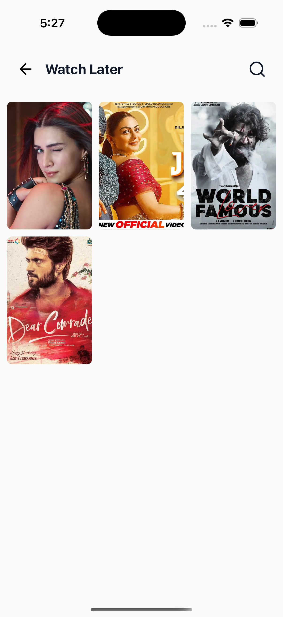
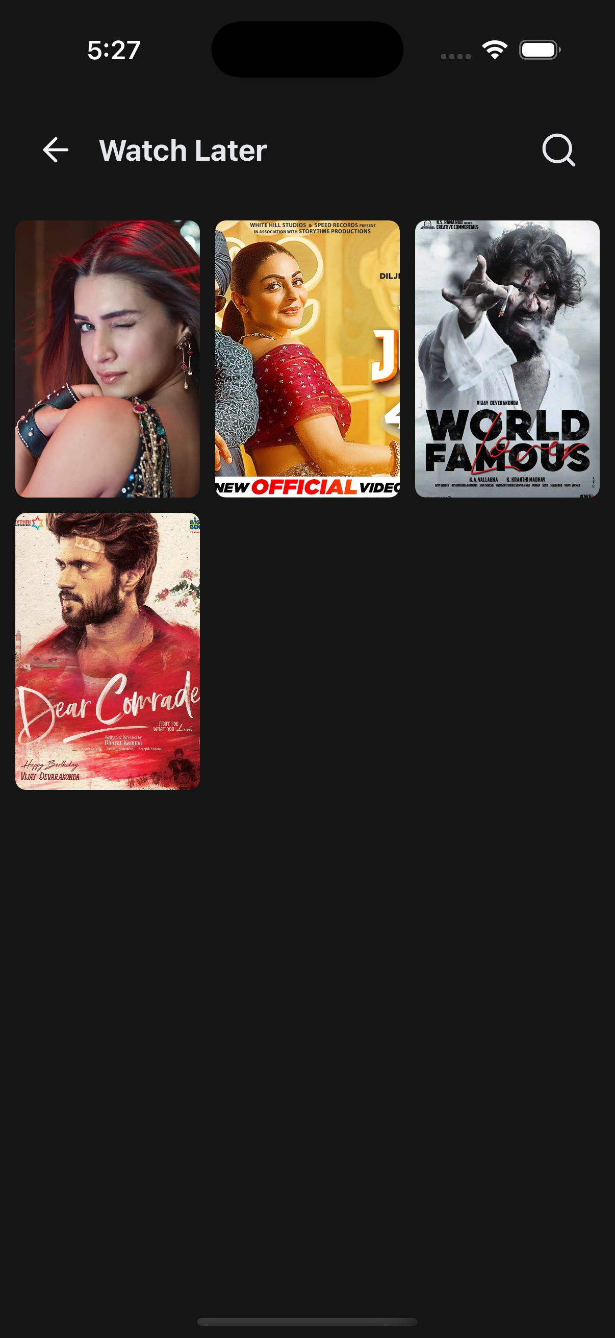
📸 Preview
⚙️ Key Features
| Feature | Description |
|---|---|
| 📋 Grid or List Layout | Supports both grid (poster) and list (detailed) views |
| 🌃 Theme Support | Adapts styling based on app theme |
| 🕐 Loading States | Shows skeleton UI while data is fetching |
| 📬 Empty States | Shows fallback UI when no Watch Later data is found |
| 🔍 Search & Back | Optional handlers for navigation actions |
| 🧹 Extendable UI | Accepts custom renderers for header, items, skeletons, and empty states |
📡 API Call Methods
⚙️ First, set up the
getZezoOttAPI client: API Client Setup
🧪 The following API method is used to fetch saved Watch Later content:
- 🔗
getZezoOtt().favorites.get()— Fetch list of user’s Watch Later items
🧑💻 Example Usage
UserWatchLaterScreen.tsx
import React from "react";
import {
  SafeAreaWrapper,
  WatchLater,
} from "@zezosoft/zezo-ott-react-native-ui-kit";
import { goBack } from "@ZezoOtt/utils/NavigationUtil";

const UserWatchLaterScreen = () => {
  return (
    <SafeAreaWrapper>
      <WatchLater
        data={[]} // your API response array of Watch Later items
        onBackPress={() => goBack()}
      />
    </SafeAreaWrapper>
  );
};

export default UserWatchLaterScreen;
🔗 See related route definition:
Routeenum from@navigation/routes.ts
📦 WatchLater Props
| Prop | Type | Description |
|---|---|---|
data | IWatchLaterItem[] | Array of saved Watch Later content |
isLoading | boolean | Whether the data is currently loading |
title | string | Optional header title |
headerComponent | React.ReactNode | Custom header override |
onBackPress | () => void | Back navigation callback |
onSearchPress | () => void | Search icon action handler |
showSearchIcon | boolean | Toggle search icon visibility |
itemDimension | number | Width of each grid item |
spacing | number | Grid item spacing |
renderItem | (item, index) => ReactElement | Custom item renderer |
skeletonCount | number | Number of loading skeletons shown |
skeletonComponent | ReactElement | Custom skeleton component |
noDataComponent | React.ReactNode | Custom fallback UI when no data available |
noDataText | string | Text shown when no Watch Later is found |
onPressItem | (item) => void | Callback for item press |
onEndReached | () => void | Triggers when scroll reaches bottom |
onEndReachedThreshold | number | Scroll threshold to trigger pagination |
viewMode | poster detailed | View style for list (detailed) or grid (poster) |
theme | AppTheme | Optional custom theme for colors, fonts, etc. |
✅ Summary
- 🕒 Displays a responsive list of saved Watch Later content
- 🧹 Fully customizable with render props and overrides
- 🌃 Supports dark/light themes out of the box
- 🚀 Works seamlessly with
react-queryand dummy data - 📬 Graceful fallback states for loading and no content
✍️ Created by Naresh Dhamu – Powered by ZezoSoft.
Last updated on