📝 BlogView
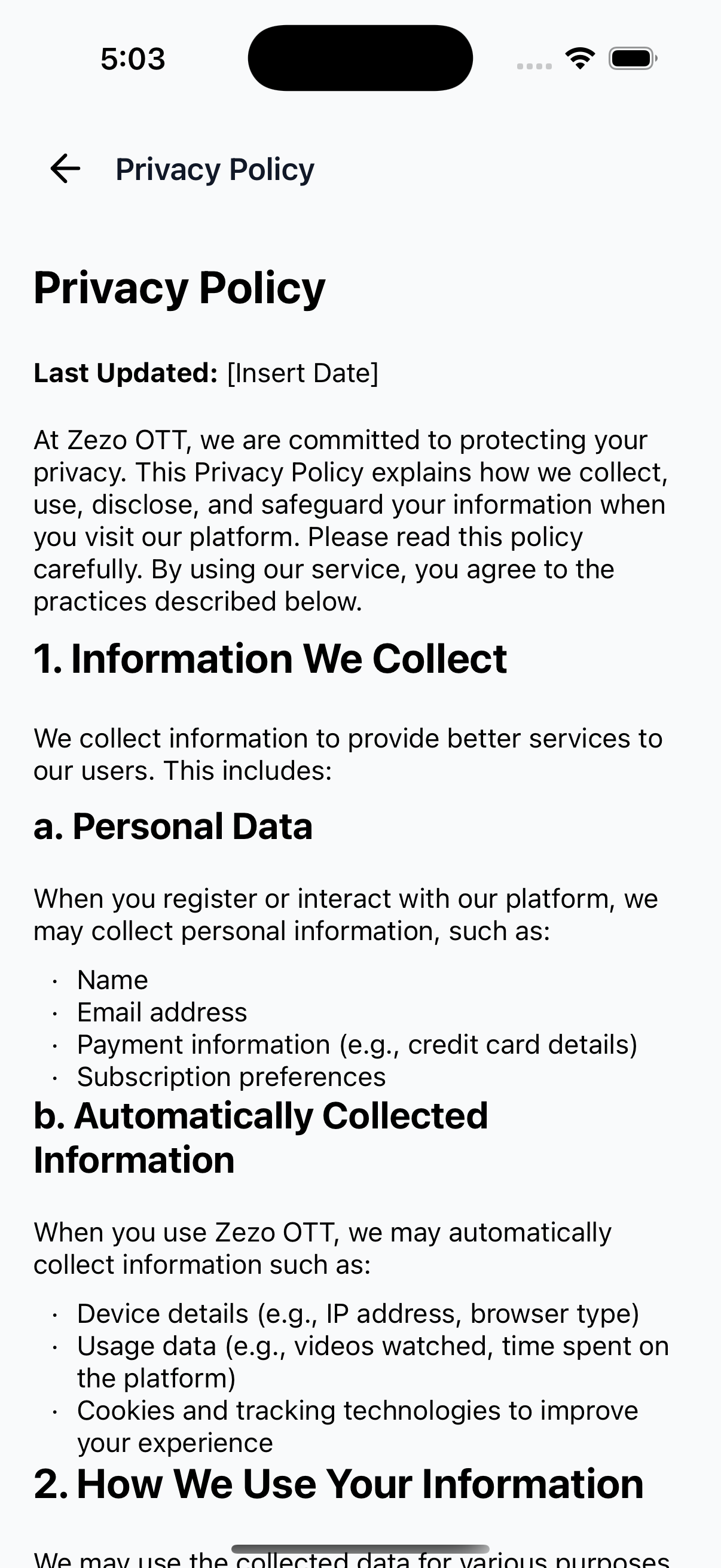
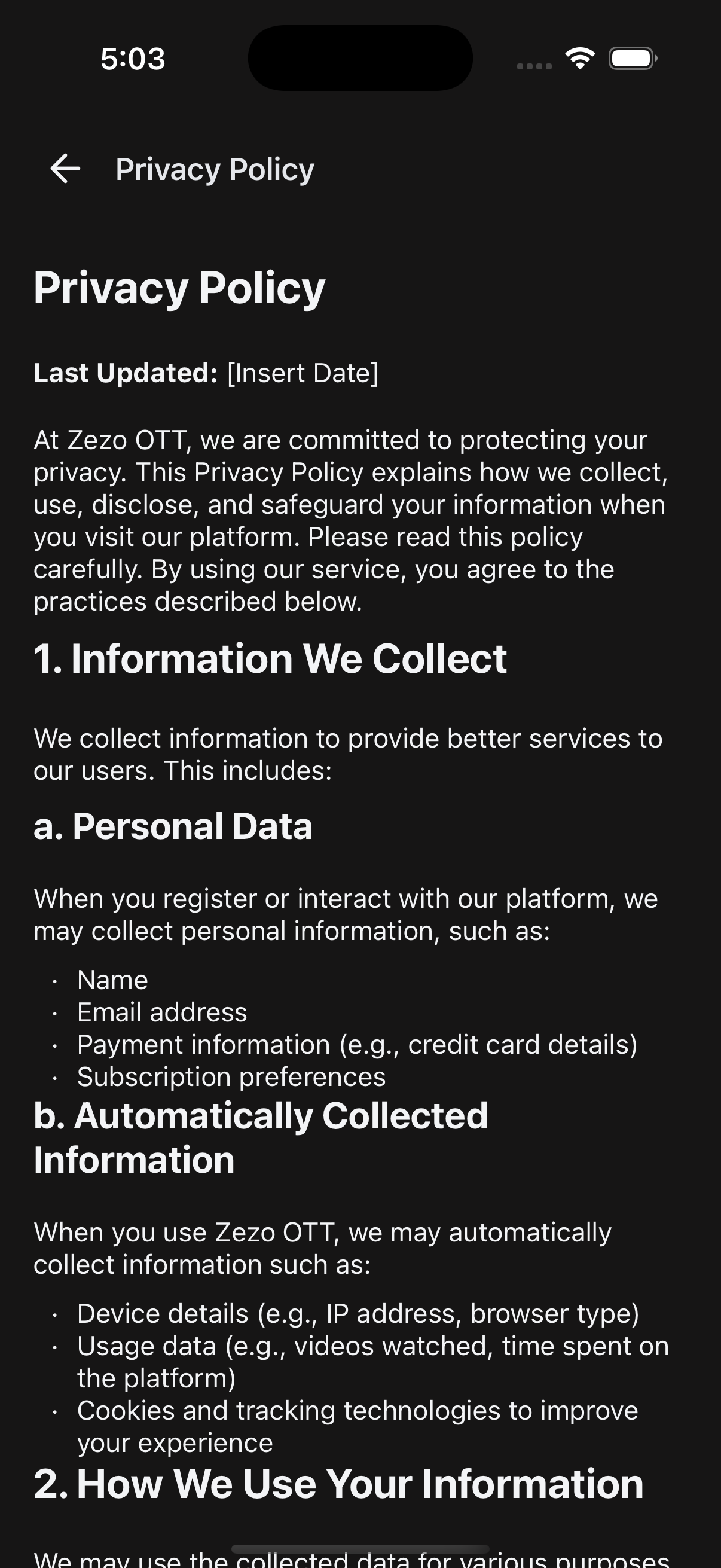
BlogView is a flexible and customizable blog viewer component designed for OTT-style React Native apps. It renders Markdown or HTML content with full support for theming, error/empty states, custom headers, and optional content overrides.
✨ Features
- 🧾 Render content from Markdown or HTML sources
- 🎨 Theme-aware (light/dark/custom)
- 💨 Loading and empty state management
- 🔧 Supports scrollable and non-scrollable modes
- 🧱 Header override support with title or custom render
- ⚙️ Custom renderers for content, header, and empty views
📸 Preview
📱 API Call
🔗 Call your own blog API endpoint to fetch and pass content into the
BlogViewcomponent.
🚀 Usage Example
BlogScreen.tsx
import React from "react";
import {
  SafeAreaWrapper,
  BlogView,
} from "@zezosoft/zezo-ott-react-native-ui-kit";
import { goBack } from "@ZezoOtt/utils/NavigationUtil";

const BlogScreen = () => {
  return (
    <SafeAreaWrapper>
      <BlogView
        content={} // your API response field: blog_content
        headerTitle={"Blog"} // your API response field: title
        isLoading={false} // your API response field: loading state
        emptyText="No blog found"
        onBackPress={() => goBack()}
      />
    </SafeAreaWrapper>
  );
};

export default BlogScreen;
🔗 See related route definition:
Routeenum from@navigation/routes.ts
⚙️ Props
📌 Core Configuration
| Prop | Type | Description |
|---|---|---|
content | string | Blog content in Markdown or HTML format |
isLoading | boolean | Show loader when content is loading |
emptyText | string | Text shown when blog content is empty |
theme | AppTheme | Optional theme override (light/dark/custom) |
🧱 Header Config
| Prop | Type | Description |
|---|---|---|
headerTitle | string | Text to display in the default header |
onBackPress | () => void | Function triggered on back button press |
onRightPress | () => void | Optional function for right-side icon press |
headerComponent | ReactNode | Replace default header with a custom one |
renderHeader | () => ReactNode | Render custom header via function |
📜 Content Rendering
| Prop | Type | Description |
|---|---|---|
scrollable | boolean | Enable scroll view for content (default: true) |
renderContent | () => ReactNode | Fully override content rendering |
renderEmpty | () => ReactNode | Fully override empty state rendering |
🎨 Styling Props
| Prop | Type | Description |
|---|---|---|
containerStyle | ViewStyle | Style override for main container |
🧠 Best Practices
- ✅ Always sanitize and validate Markdown/HTML before rendering.
- ✅ Use
scrollable={false}when embedding in fixed-height modals or cards. - ✅ Use
renderContentwhen embedding custom components like ads or polls. - ✅ Provide
emptyTextorrenderEmptyto handle empty blog gracefully. - ✅ Use header overrides (
renderHeaderorheaderComponent) for layout consistency with custom screens.
🖼️ Layout Overview
- 🔙 Optional Back Button (default or custom)
- 💼 Title or Custom Header
- 📜 Scrollable or Static Blog Content
- 💨 Loading Indicator (optional)
- ❌ Empty State with fallback text or custom renderer
👍 Created by Naresh Dhamu – Powered by ZezoSoft.
Last updated on

