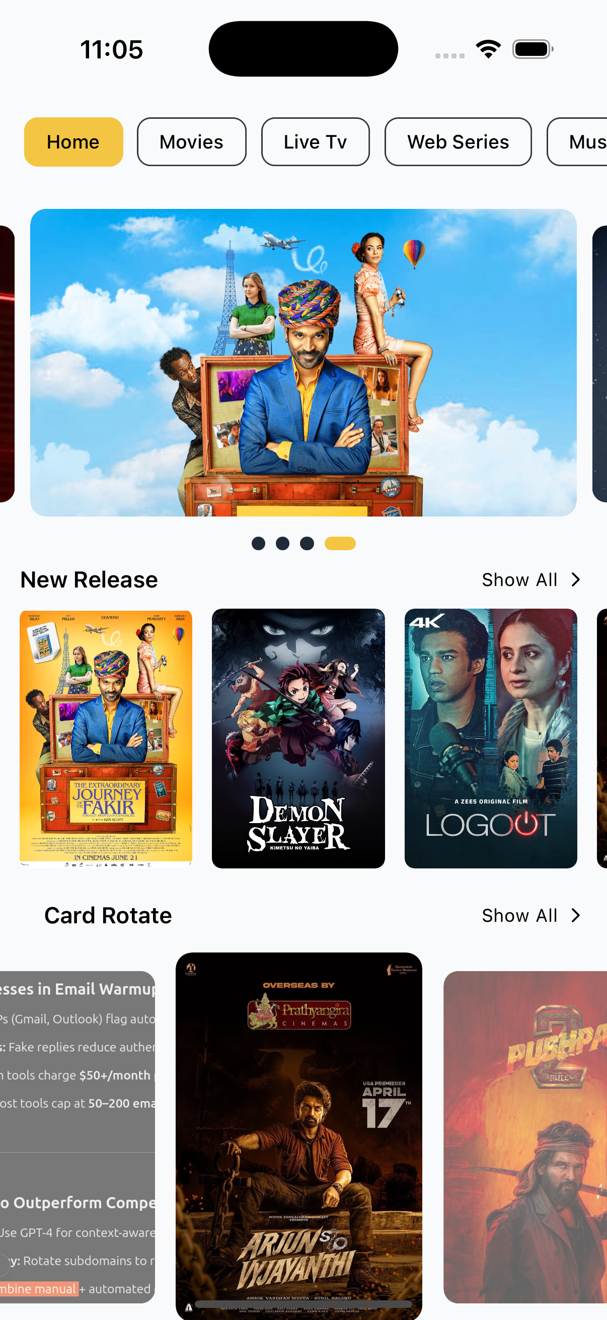
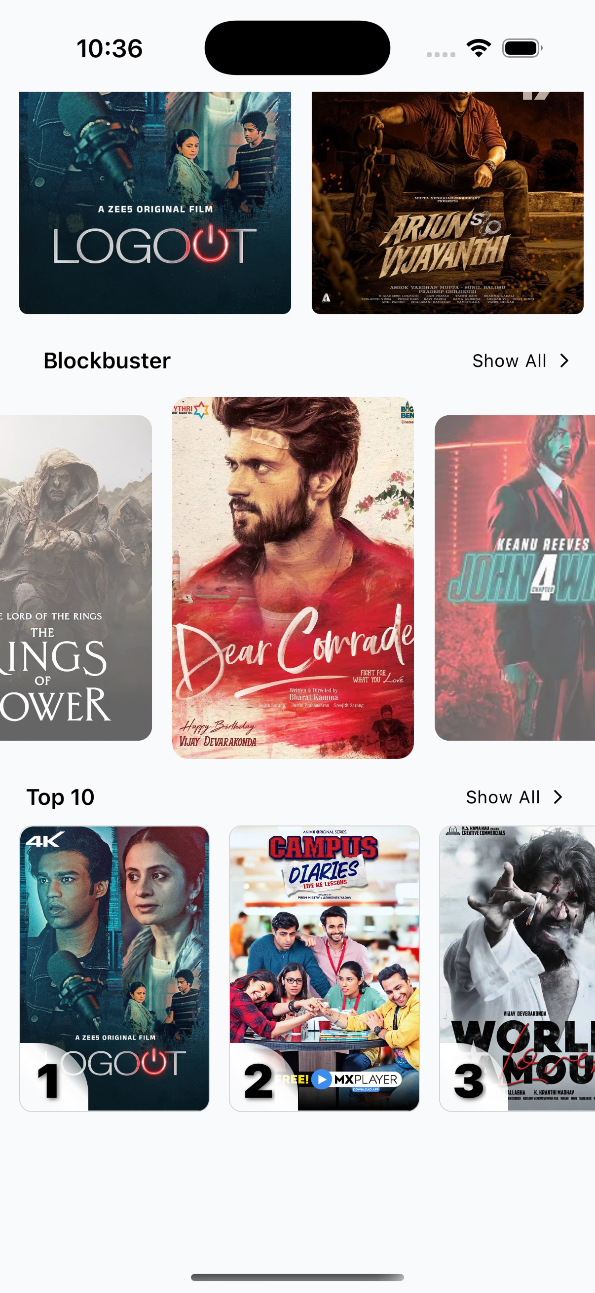
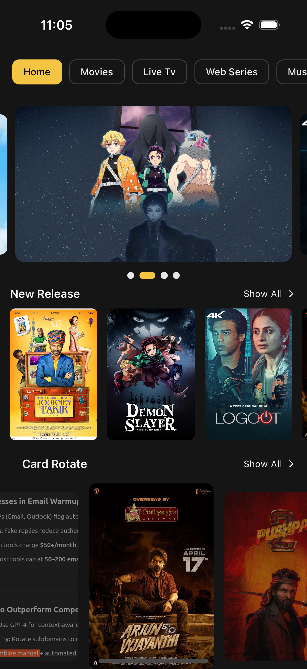
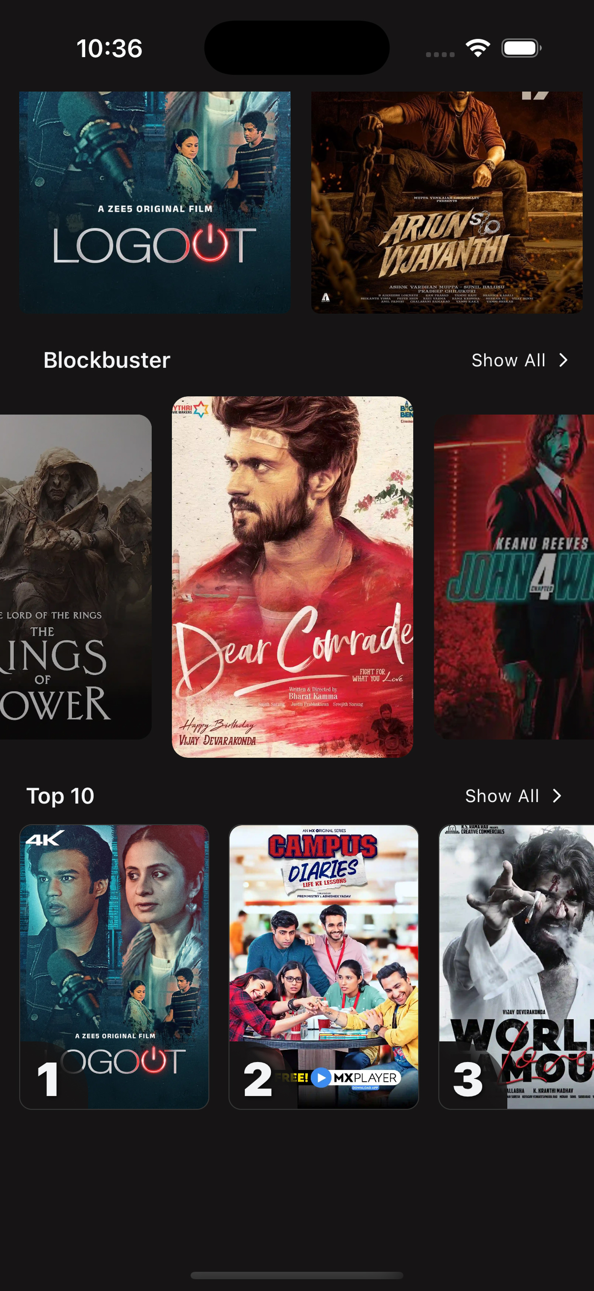
📘 Content Section
Content is a simple and flexible component built for OTT apps. It’s ideal for home screens, category pages, and personalized feeds. Display sliders, cards, Top 10s, Continue Watching, and more — all in one place.
✨ Features
- 📂 Multiple layout types: slider, card, list
- 🔁 Supports infinite scroll and pagination
- 🥒 “Continue Watching” powered by user history
- 🎨 Light & dark theme support
- 🧹 Custom UI overrides per section
- ⚠️ Built-in loading and error handling
📸 Preview
📡 API Call Methods
⚙️ First, set up the
getZezoOttAPI client: API Client Setup
🧪 The following API methods are used to fetch core content data for the app:
- 🔗
getZezoOtt().sections.get()— Fetch content sections - 🔗
getZezoOtt().categories.get()— Fetch category list - 🔗
getZezoOtt().history.get()— Fetch user watch history
🛠️ Props
contentData
{
  category?: ICategory[];
  sectionData: IGetSectionData[] | null;
  historyData?: IHistoryItem[];
}- Contains content sections, categories, and user watch history.
customComponents
ICustomComponentsForContent[] // { type: string; component: ReactElement }- Plug in your own UI per section type (
slider,top10, etc).
Loaders & Error Components
| Prop | Description |
|---|---|
LoaderComponent | Displayed during initial load |
ErrorComponent | Shown when there’s an error or no data |
InfiniteScrollLoaderComponent | Shown while fetching more items on scroll |
Scroll & Pagination
| Prop | Description |
|---|---|
onScroll | Triggered on scroll — useful for animations |
onEndReached | Called when user hits bottom — use for pagination |
moreFetchData | Load more for regular sections |
moreFetchDataHistory | Load more for “Continue Watching” |
Interaction Events
{
  onPressItem?: (item: IContentData) => void;
  onPressMore?: (params: { section_id: string; name: string; type: string }) => void;
  activeCategory?: ICategory;
  onPressCategory?: (category: ICategory) => void;
}| Event | Description |
|---|---|
onPressItem | When a content item is tapped |
onPressMore | When “More” is clicked |
activeCategory | Currently selected category |
onPressCategory | When a category is tapped |
Misc Props
| Prop | Description |
|---|---|
sectionProps | { showPlayBtn?: boolean } — toggle play button |
isLoading | { category?: boolean; history?: boolean; section?: boolean; } |
theme | Your app’s theme config |
contentContainerStyle | Style overrides for the main container |
🧪 Example
HomeScreen.tsx
import { Content } from "@zezosoft/zezo-ott-react-native-ui-kit";

<Content
  contentData={{
    // Replace with actual API response from `getZezoOtt().sections.get()`
    sectionData: [],
  }}
/>;
✅ Prop Summary
| Prop Name | Purpose |
|---|---|
contentData | Content, categories, and history |
customComponents | Custom UI for sections |
LoaderComponent | Shown while loading |
ErrorComponent | Shown on error or empty state |
InfiniteScrollLoaderComponent | Loader during scroll-based fetching |
onScroll | Scroll event handler |
onEndReached | Pagination trigger |
theme | App theme config |
events | Interaction event handlers |
sectionProps | Section-level UI options |
moreFetchData | Fetch more section content |
moreFetchDataHistory | Fetch more history items |
contentContainerStyle | Custom styles for main container |
isLoading | Individual loading state toggles |
✍️ Created by Naresh Dhamu – Powered by ZezoSoft
Last updated on