🎞️ Watch History Screen
An elegant implementation of the WatchHistory component that presents users with a scrollable grid of previously watched movies, shows, and live streams — complete with theming, empty/loading states, and customization options.
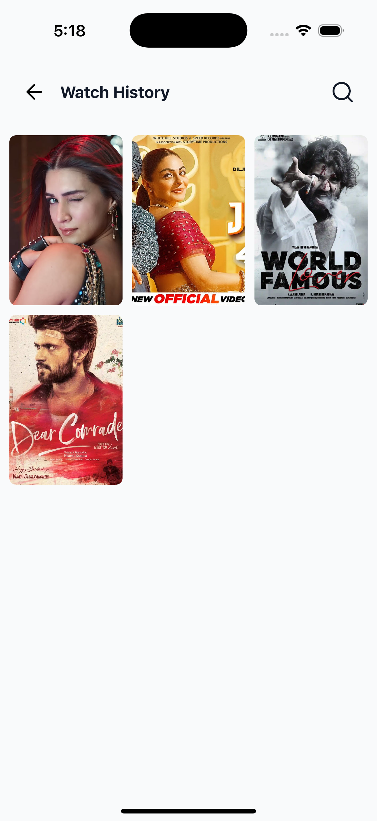
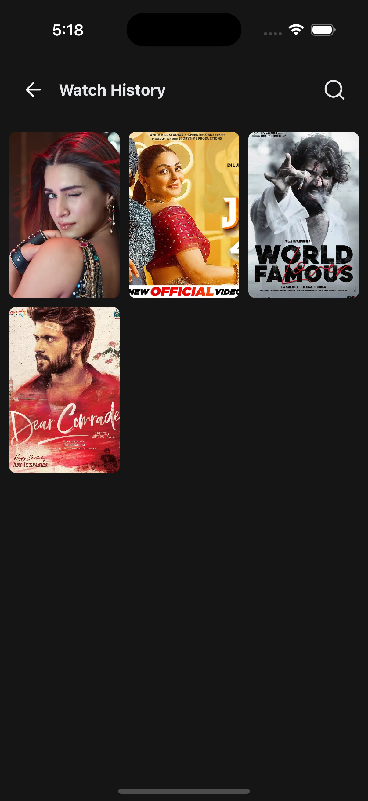
📸 Preview
⚙️ Key Features
| Feature | Description |
|---|---|
| 🎯 Grid Layout | Displays history items in a responsive grid using react-native-super-grid |
| 🌃 Theme Support | Adapts styling based on app theme |
| 🕐 Loading States | Shows skeleton UI while data is fetching |
| 📬 Empty States | Shows fallback UI when no history data is found |
| 🔍 Search & Back | Optional handlers for navigation actions |
| 🧹 Extendable UI | Accepts custom renderers for header, items, skeletons, and empty states |
📡 API Call Methods
⚙️ First, set up the
getZezoOttAPI client: API Client Setup
🧪 The following API method is used to fetch user watch history:
- 🔗
getZezoOtt().history.get()— Fetch list of previously watched content
🧑💻 Example Usage
UserHistoryScreen.tsx
import React from "react";
import {
  SafeAreaWrapper,
  WatchHistory,
} from "@zezosoft/zezo-ott-react-native-ui-kit";
import { goBack } from "@ZezoOtt/utils/NavigationUtil";

const UserHistoryScreen = () => {
  return (
    <SafeAreaWrapper>
      <WatchHistory
        data={[]} // your API response array of watch history data
        onBackPress={() => goBack()}
        onSearchPress={() => {}}
      />
    </SafeAreaWrapper>
  );
};

export default UserHistoryScreen;
🔗 See related route definition:
Routeenum from@navigation/routes.ts
📦 WatchHistory Props
| Prop | Type | Description |
|---|---|---|
data | IHistoryItem[] | Array of previously watched content |
isLoading | boolean | Whether the data is currently loading |
title | string | Optional header title |
headerComponent | React.ReactNode | Custom header override |
onBackPress | () => void | Back navigation callback |
onSearchPress | () => void | Search icon action handler |
showSearchIcon | boolean | Toggle search icon visibility |
itemDimension | number | Width of each grid item |
spacing | number | Grid item spacing |
renderItem | (item, index) => ReactElement | Custom item renderer |
skeletonCount | number | Number of loading skeletons shown |
skeletonComponent | ReactElement | Custom skeleton component |
noDataComponent | React.ReactNode | Custom fallback UI when no data available |
noDataText | string | Text shown when no history is found |
onPressItem | (item) => void | Callback for item press |
onEndReached | () => void | Triggers when scroll reaches bottom |
onEndReachedThreshold | number | Scroll threshold to trigger pagination |
🧠 Behavior Notes
- Uses
CardPosteras the default item renderer - Handles layout with
FlatGrid - Theming support via
useTheme() - Designed for plug-and-play integration
✅ Summary
- 🎥 Displays a rich, scrollable grid of watch history content
- 🧹 Fully customizable with render props and overrides
- 🌃 Supports dark/light themes out of the box
- 🚀 Ready-to-use and compatible with real data fetching (e.g.
react-query) - 📬 Smooth fallback experience for empty and loading states
✍️ Created by Naresh Dhamu – Powered by ZezoSoft.
Last updated on